Viewing Macros and Progress.
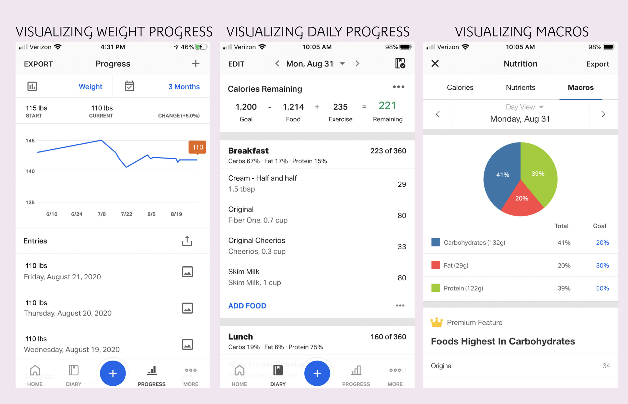
Currently, there’s no way to view macros, progress and daily calories together to see the big picture. Also, users explained they were confused about “progress” on main nav. Progress can mean lots of different things beyond weight loss and gain. It’s a helpful tool, but confusing here.

“Home” Frame is too busy
Home tab has too many article items and is visually similar to the diary page making it confusing to use. It operates as a feed like instagram but without the reward of a typical feed. After doing competitor research (apple health app, crunch fitness app, noom, loseit), I found that a dashboard that organizes daily calories, plans and other info is more effective.

Streaks and Profile Pages
Streaks are only visible in the “more” tab. This doesn’t make sense as streaks have come up in user testing and user reviews of the app as an important tool for the user. Finding the correct profile to view streaks is confusing too because there appears to be three different screens that function as profiles and homepages.

Reminders
Current user flow for adding reminders to meals as a push notification. This isnt easy to turn on/off and user forgets to use because it’s tedious. This is a simple fix by adding reminders in a more accessible place.