PostUp Design Sprint
My Role
As a lead product designer, I create a prototyped solution by addressing the needs and behaviors of users. In addition, I created all illustrations and developed the UI for the prototype.
Challenge brief
PostUp is a new startup that wants to make it easier for freelancers and remote workers to find great coffeeshops and public spaces to do work from. This challenge was done as an exercise through Bitesize UX.
Research
User Interviews
User Interviews were provided by Joe, the lead researcher at Bitesize UX. He conducted interviews with 9 people who currently work as freelancers or remote workers that work in public spaces. I’ve included a few important quotes that helped target user pain points
“Tell us about your experience finding a public place to do work from”


User Persona

Research Takeaways

“the information that’s out there is time consuming to dig through and takes alot of jumping back and forth between apps.”
To learn more about the needs of PostUp users, I analyzed interview highlights, a persona, and watched a user walk through how they currently look for a place to work. I used affinity mapping to group common themes. Chelsea, the freelancer who did the usability test gave us some great feedback including the quote above.
Key Takeaways
Crowd
User wants to know how crowded or noisy a place is
Amenities
User wants to know about amenities, like free wifi and outlets
Location
User wants to find a place close to them
Photos
User wants to see photos of space to see if it meets their needs
Competitive Analysis

Four Square: The map view shows flags with corresponding numbers. A simple solve for viewing what’s nearby

The Hitlist: A clean interface with simple, large images that really showcase the photo. I like the “My Hitlist” Feature as a way for PostUp users to save favorite working spots.

Spots: The filters screen is simple and clear. The icons used are great as well.
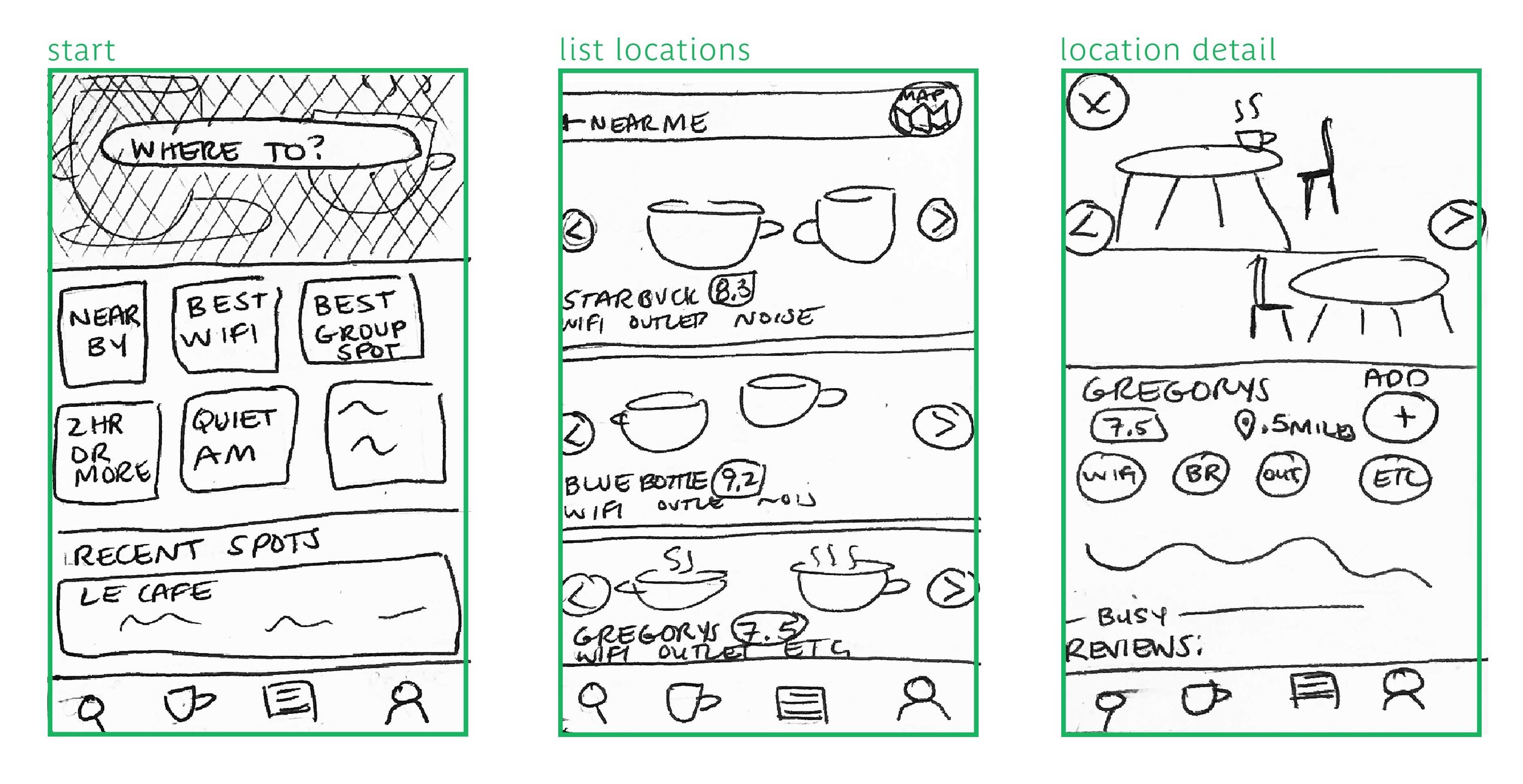
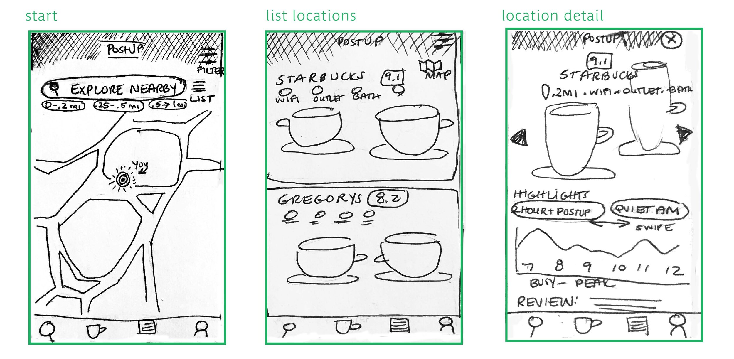
Rough Sketches
Using Crazy Nines (a version of the Crazy Eights method) I jotted down three iterations of a start, list location and location detail screen and refined the ideas to get some ideas on paper.I then took the ideas and expanded on them, sketching out some more detailed solutions. The solutions that made the most sense to me highlight large photos of the space, gave a clear indication of amenities (wifi etc) and showed the user proximity both visually through a map and text.
High Fidelity Wireframe
Onboarding Screen
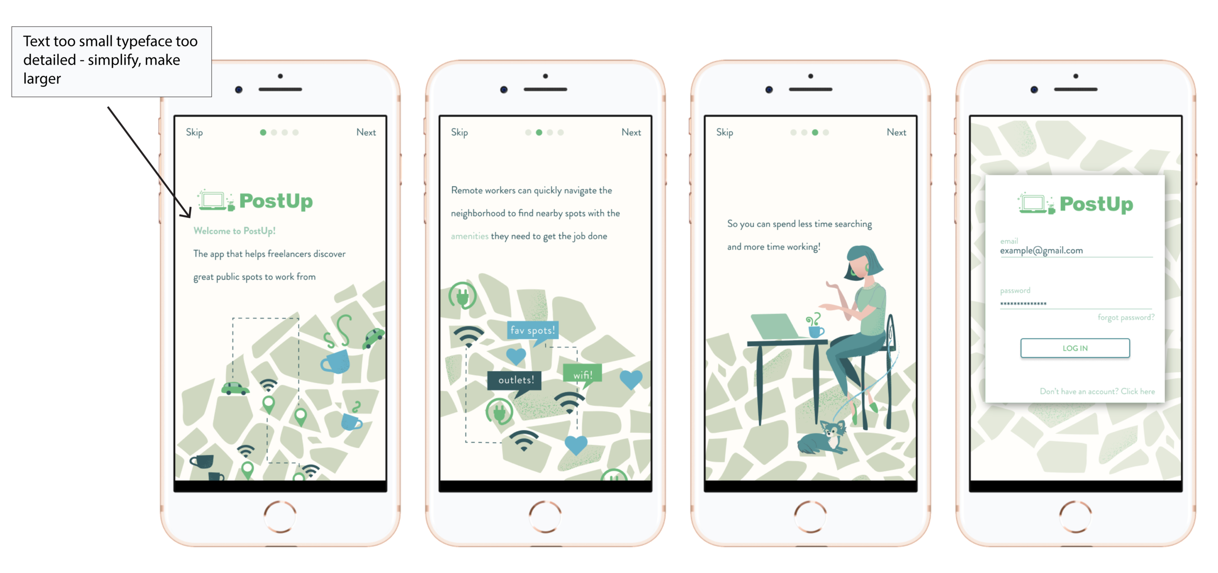
I added an onboarding screen to help introduce the PostUp to users. Below is the initial sketch of the onboarding experience without images, or text styles. I highlighted user interactions to make clear the options user has.

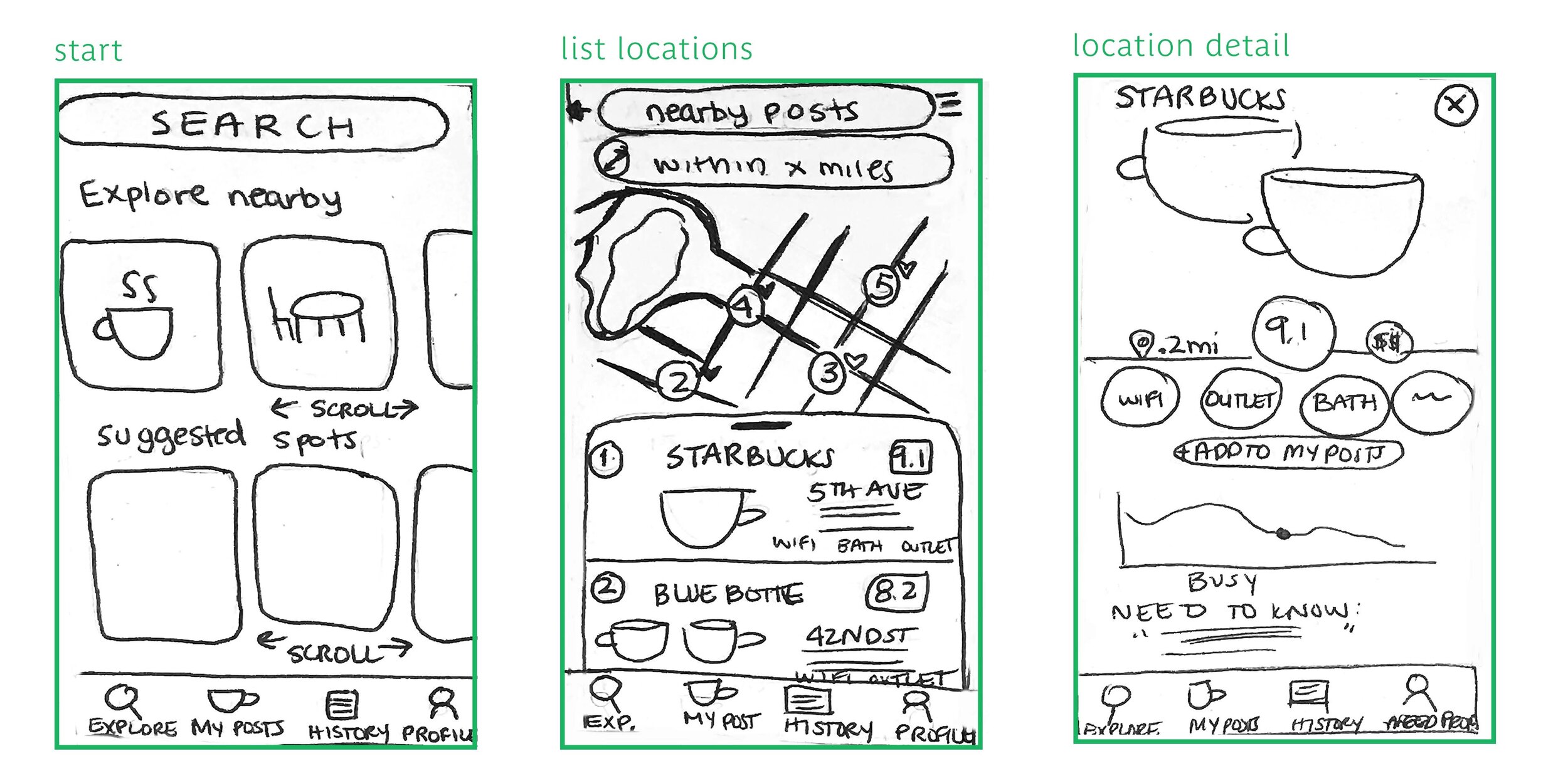
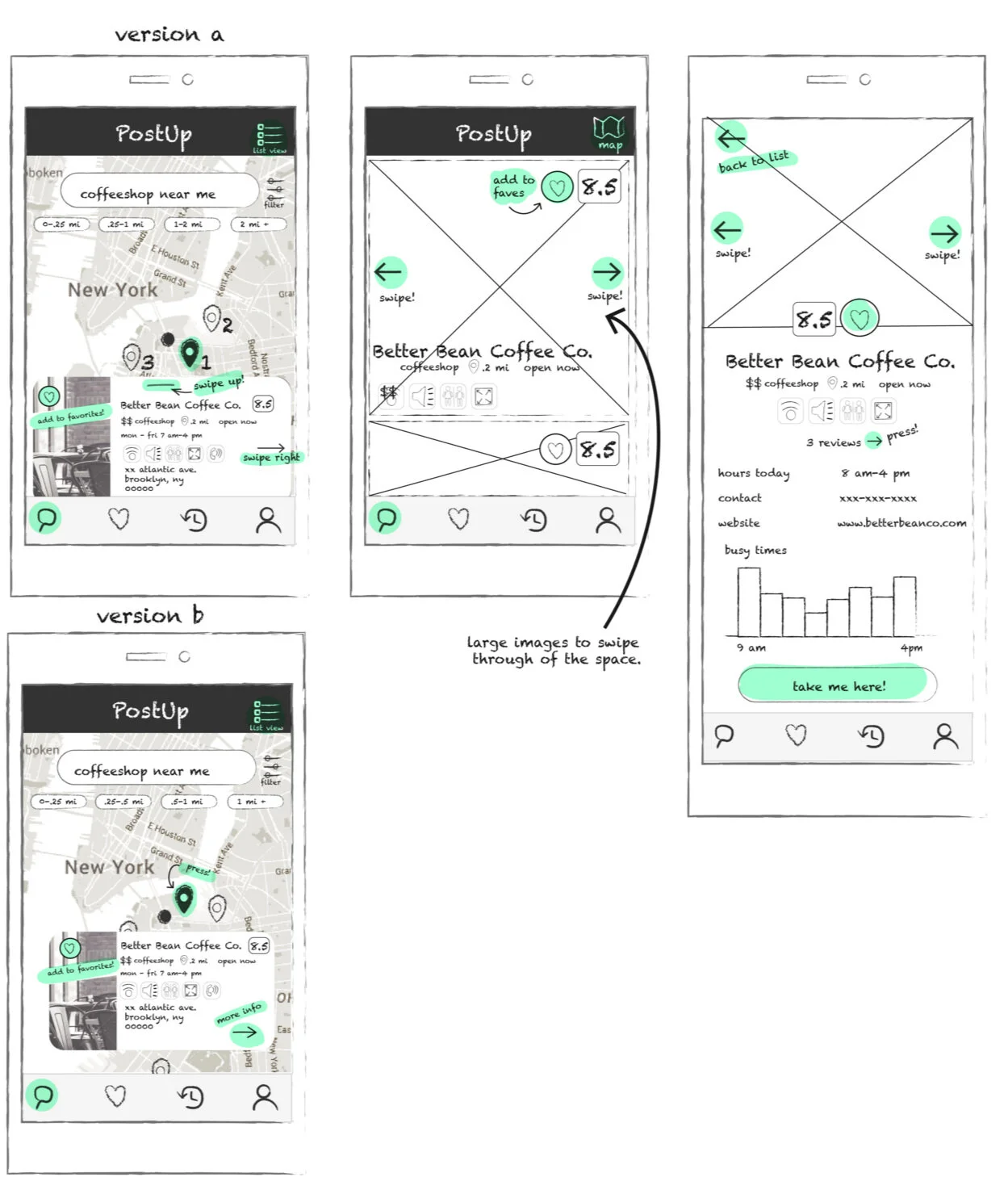
PostUp Search and detailed views
I started with a map search, and highlighted proximity below to the search window. I made two versions of the map views…Version A has numbered map markers with a swipe screen that shows you the work spots in order by proximity. Version B shows map markers that are clickable/pressable to give an overlay with details of the coffeeshop/postup spot. I’d like to do some A/B testing to see what users prefer.
Final Prototype
I created the first version of a working prototype in Figma. See below for the final screenshots of the onboarding screen and a simple interaction of finding a place to “post-up”. I simplified the onboarding screen and after A/B testing, decided on version A of the search results screen because grounding the results at the bottom of the screen made the best use of screen space. It was difficult for users to scroll around the map and view pop up results. This wouldn’t work on mobile. I tested this version of the UI with 5 users and decided to make some changes. See below for callouts.

Based on the feedback, I simplified the overall experience to make the final prototype. PLEASE NOTE - Disclaimer: I do not own the photographs used or the map illustration (see: The Infatuation). Postup logo was provided by Bitesize UX all other illustrations are owned/created by me.


User Testing and Next Steps
Testing the Final Prototype
Overall, this project was a great way to address the UX process in a short time. I found after final testing, users wanted some more detailed amenities. I thought intially that I wouldn’t need an option for “having food” since I thought it was intuitive through the search results: library type setting wouldn’t offer food but a cafe would. But users cited wanting the option to filter it so they could get results that showed only spots with food or only spots without. Also, although I had an option for “lots of space” users cited wanting an option that specified it was “great for groups”. They weren’t sure if having lots of space would be for a solo worker with lots of elbow room or a group meeting taking place in public.
Final Thoughts
In hindsight, I found that I was stuck on certain solutions early on that I assumed would work such as the pill buttons with the exact distances labeled. I used that solution from sketching to the first working prototype. Now looking back, it seems like a no-brainer that this is too much information and too confusing. Definitely a small interaction that when simplified, made for a much easier experience. Something to remember in the early stages of design. Go forward, I would tweak the amenity offerings and test it in a public setting at spots people would normally post up in to get a better idea if the amenities work for them as this is what makes the app stand apart from other apps like yelp or google.